

About Brand
Mitaara is a Jaipur-based textile brand created to make traditional Indian suit fabrics easier to discover, choose, and wear in everyday life. The brand focuses on pre-arranged suit sets, coordinated fabrics for kurta, bottoms, and dupatta, so customers don’t have to piece together matching materials themselves. The goal is to simplify the buying experience while preserving the richness of Jaipur’s textile heritage.
my role
Client
Duration
Tools
Shopify
Wix
Figma
Adobe Illustrator
contribution
Team
Devangi, Graphic Designer
Mitushi Udaiwal, Lead Designer
Piyush, Mentor (VP)
About Parent Company:
prasath jaipur
Prasath Jaipur is a textile brand based in Jaipur, known for its blend of tradition and contemporary aesthetics. Their offerings include:
Wholesale Fabrics: A wide variety of prints, textures, and styles.
Pre-arranged Fabric Sets: Customizable fabric combinations, such as 2m cloth for upper garments and 1.5m cloth for lower garments.
Printing Techniques: Primarily screen printing, with exclusive block printing for special orders.
Eco-Friendly Practices: Use of azo-free dyes to promote sustainability without compromising fabric quality.
They are B-B, now shifting to B-C
Process
Developed our website through following Steps:
Define, Discover, Design, Deliver

01 define
where the project began
India has a rich textile and craft culture, yet most handcrafted brands today fall into two extremes:
Either overly traditional and difficult for younger audiences to connect with
Or overly modern, losing authenticity and emotional value
The gap observed was clear: There is space for a brand that feels rooted in craft but relevant to contemporary lifestyles.
The goal was not just to create another craft brand, but to build a bridge between heritage and modern expression.
Understanding the Brand Values
Before moving forward, it was important to recognise what already exists within the brand and should be preserved:
A process-driven approach rooted in textile making.
Use of azo-friendly dyes which allow a wider range of colours, better durability, and efficient production.
The ability to maintain comparatively lower pricing due to controlled production processes.
A focus on practical, everyday garments rather than luxury positioning.
These aspects became important anchors while defining the visual direction of the brand.
defining the core problem
defining goals
The Define phase helped clarify what success looks like:
Build a brand that feels warm, human, and trustworthy
Avoid over-ethnic or overly luxury positioning
Create visual language adaptable for digital platforms
Make craft approachable for younger audiences
Establish emotional differentiation from competitors
who are we designing for?
Instead of broad demographics, the audience was defined through behaviour:
Primary Audience
Urban, design-aware individuals (Women aged 22–40)
Appreciate handmade and slow fashion
Prefer meaningful purchases over mass-produced goods
Value story, origin, and material authenticity
Secondary Audience
Resellers
Boutique owners
Gift buyers seeking emotional value
final define statement
This became the guiding line moving forward:
“To create a contemporary craft brand that builds emotional connection through authenticity, warmth, and everyday relevance.”
This statement directly informed all decisions in Discovery.
understanding before designing
Before moving into identity or website design, it was important for us to first understand what Mitaara actually is, beyond just being a textile business.
The brand was not starting from zero, it already had experience in manufacturing and selling fabrics offline. However, the intention now was different. The goal was to reintroduce the brand digitally, reach customers beyond Jaipur, and eventually sell across India through an online platform.
The questions guiding this phase were simple:
How are handcrafted brands communicating today?
What makes people trust craft-based products?
Why do some brands feel emotionally engaging while others feel transactional?
Where does the opportunity lie for a new brand?
Instead of looking for visual inspiration immediately, the focus was on understanding behaviour, perception, and positioning.
Because before deciding how the brand should look, it was important to understand how it should feel.
Understanding the current landscape
Mitaara is a Jaipur-based textile brand primarily dealing in:
Screen printed fabrics
Traditional-inspired prints with modern colour palettes
Suit sets sold as fabric combinations (top + bottom sets)
Wholesale as well as direct retail selling
During conversations with the client, one important insight emerged:
The brand had been inactive for almost two years. The intention behind rebranding was not just visual change, but a fresh beginning - starting from neutral again instead of carrying forward a negative perception.
The idea explained by the client stayed with me:
“It’s easier to grow positively from zero than to repair something already perceived negatively.”
This insight later influenced the decision of creating a fresh identity and name, rather than modifying the existing one.
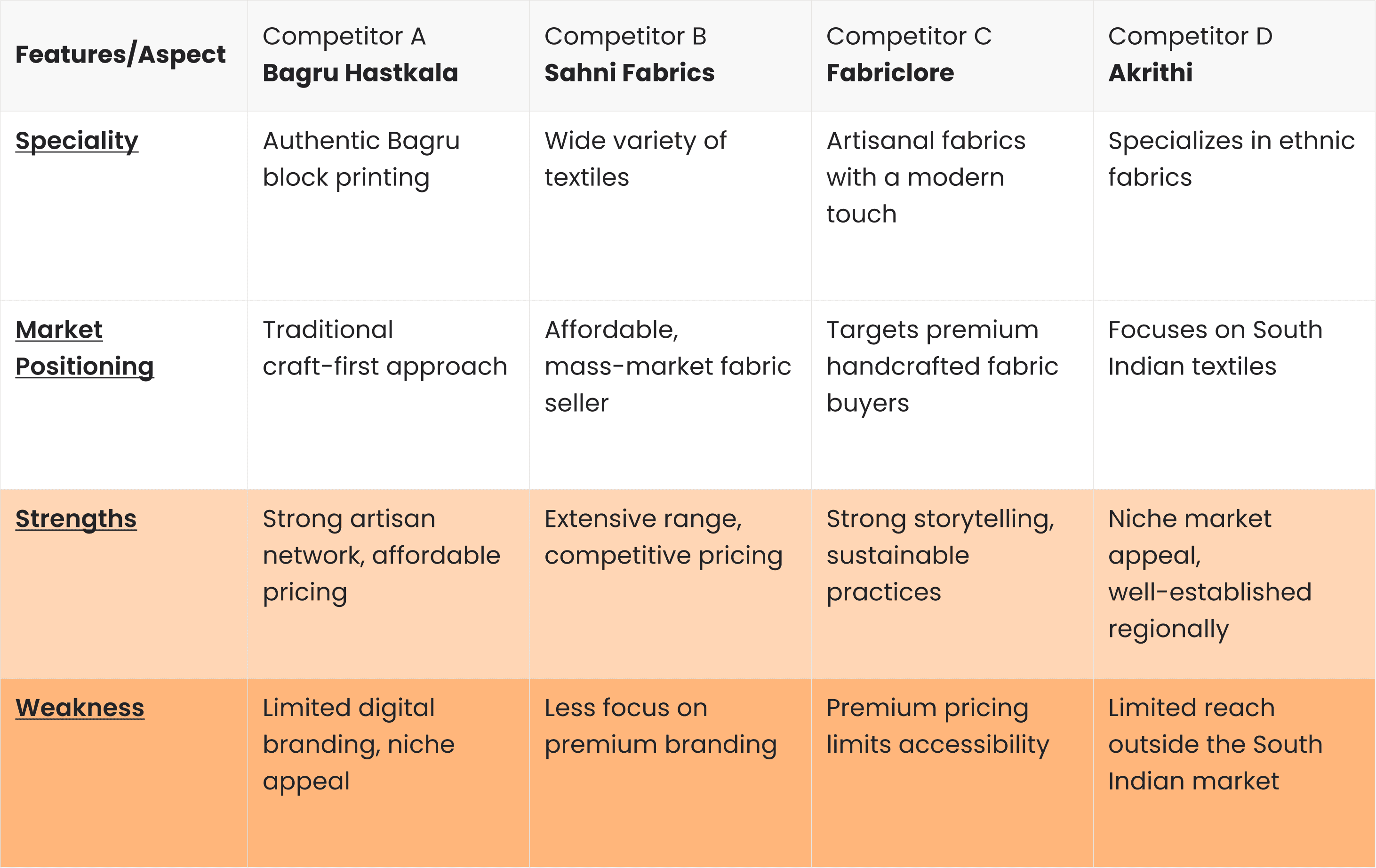
Competitive Understanding
To understand the current landscape, focusing ONLY on brands selling fabric (not ready-to-wear apparel). Identified brands based on market relevance, pricing strategy, and customer segment also similar craft and textile brands such as Bagru Hastkala, Sahini Fabrics, Akrithi, Fabriclore.
Each brand approached storytelling and sustainability differently:
Some focused strongly on heritage and process.
Some leaned towards modern presentation and lifestyle appeal.
Others highlighted sustainability and affordability.


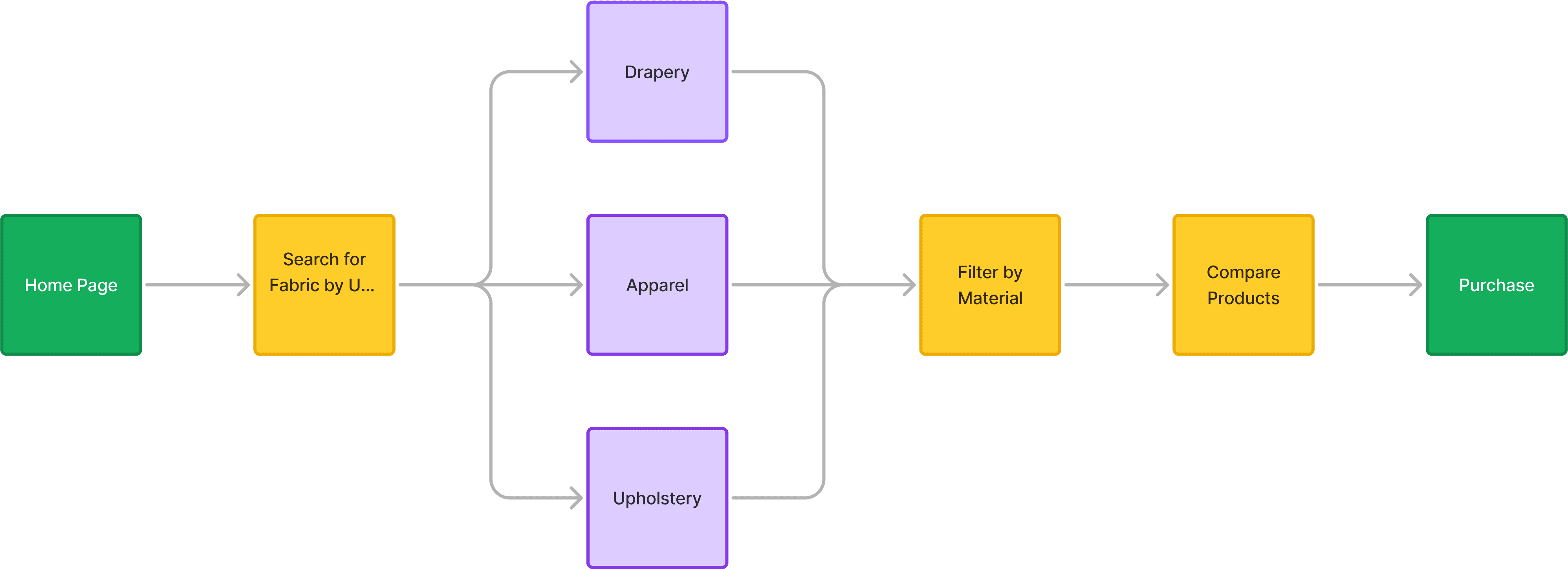
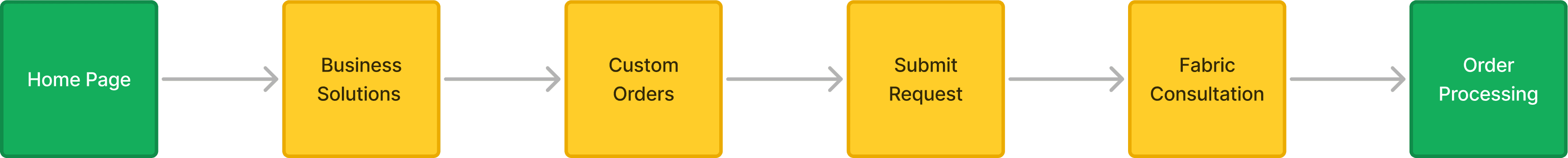
Flow analysis of the brands


Click here to view complete "survey findings" and "survey questionnaire" in details
Incorporate fabric storytelling and educational content but balance text with visuals.
Integrate artisan stories into product pages to add authenticity and trust.
Adopt a structured, easy-to-follow category system but reduce clutter.
Ensure a good filtering system to help users find products effortlessly.
Use dedicated sections like “New Arrivals” & “Best Sellers” to enhance product discoverability.
Custom Orders & Made-to-Order Features - Allows designers & brands to place bulk orders directly.
In category section specifically, do fix product categorization to avoid redundancy.
Ensure that small-scale buyers feel equally important by offering separate buying paths.
Emphasizing Storytelling brand like Bagru Hastkala & Folklore
Making artisans the hero of our brand. (Showcase video and photography of process)
Balancing Affordability & Exclusivity by brands like Akrithi
Inspired by Akrithi & Bagru, where handcrafted items feel premium but remain accessible.
Digital & Visual Aesthetics Matter while showcasing products
Modern appeal is essential for global reach (brands like fabriclore and sahini fabrics does)
Digital & Visual Aesthetics Matter while showcasing products
Modern appeal is essential for global reach (brands like fabriclore and sahini fabrics does)
identifying the user needs
Understanding the Core Customer Base Objective: To conduct in-depth research on primary users, focusing on their expectations, shopping behaviors, and pain points when purchasing textiles online.
6 in-depth user interviews (Handloom buyers, boutique owners, designers, and eco-conscious shoppers).
Some Key Research Questions:
What are users' biggest challenges when buying fabrics online?
What factors influence their decision-making?
What kind of product information and website features do they find most useful?
How do they currently shop for textiles, and what are their frustrations?
Click here to view detailed journey mapping of a created user persona

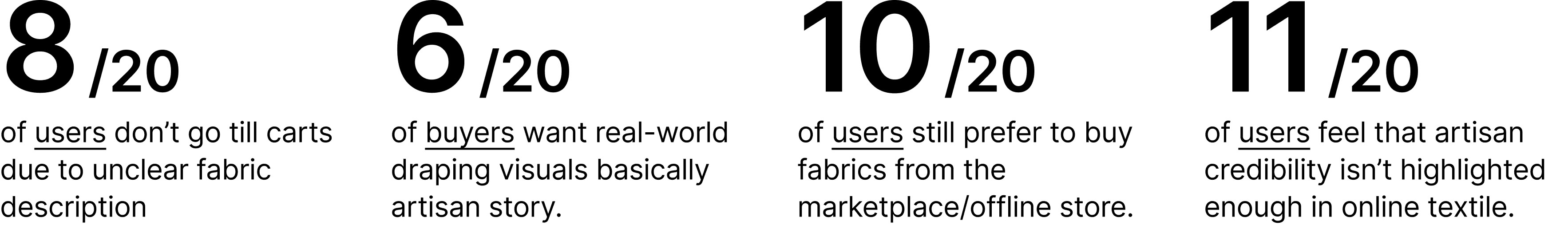
💬 “Mujhe accha handloom fabric lena hai, lekin zyada websites pe bharosa nahi hota. Weave ya quality ka dhang se mention hi nahi hota.”
💬 “Kapda actual mein kaise shapes leta hai kasie girta hai, yeh dekhna chahta hoon kharidne se pehle. Sirf ek image kaafi nahi hoti.”
💬 “Sustainable aur ethical hone ka toh sab claim karte hain, par asli mai proof ki baat karo to kisi ke pass nahi hai dikhane ko."
Many users hesitate to purchase fabrics online due to concerns about machine-made or counterfeit products.
Product listings often lack detailed descriptions of techniques, materials, and craftsmanship, making informed decisions difficult.
There is uncertainty around return policies and an inability to truly understand the fabric’s texture before buying.
Delivery timelines and limited tracking transparency create additional anxiety post-purchase.
Build trust by showcasing certifications, artisan profiles, and authentic origin stories.
Create richer product pages that explain the craft, process, and artisan credentials in depth.
Introduce transparent refund policies along with close-up videos demonstrating fabric texture and drape.
Offer proactive order updates via WhatsApp or email to reduce delivery-related uncertainty.
Payment Gateway Selection & Bank Integration
Available Payment Gateways on Wix: During our research, we found that Wix offers a total of nine payment gateways, including:
Razorpay, PayPal, Paytm Payment Gateway, PayU India, Nimbbl, Easebuzz, Airpay, Cashfree Payments, Manual Payments (for other banks, direct transfers, etc.)Exploring Direct Bank Integration with HDFC: To optimize transactions and minimize processing fees, I spoke with the HDFC Bank Manager about directly integrating the HDFC Payment Gateway with Wix instead of using third-party payment processors. The benefits of this approach include
Simplified Operations
Since all payment transactions would be directly handled by HDFC Bank, we eliminate the hassle of managing multiple payment platforms and their respective policies.
03 design
Naming Exploration:
From Meaning to Identity
The naming process began with extracting keywords from earlier phases:
Connection, Warmth, Belonging, Relationship, Craft, Cultural familiarity, Softness, Everyday relevance etc.
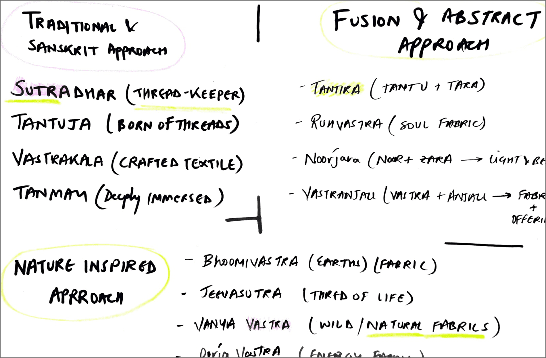

Direction 01 - Craft & Technique Based Names
Names inspired by printing processes or textile terminology.
Why rejected: Felt technical and limiting for future expansion of the brand.
Direction 02 - Location Based Names
Names derived from Jaipur or regional references like the states name eg Rajasthan etc.
Why rejected: Restricted the brand geographically despite PAN India vision.
Direction 03 - Emotional & Relational Names (Selected Direction)
Names that communicate warmth and connection rather than product type.
This direction aligned strongly with discovery insights.
Why Mitaara was finalised?
A. Breaking Down the Meaning
Mitra (मित्र) - Meaning friend, connection, bond.
Taara (तारा) - Meaning star, light, guidance.
Mit - First few letters of Mitushi (Clients Name)
B. Symbolism of ‘Mitaara’
Represents connection - Mitaara is a bridge between artisans and modern buyers.
Fluid, soft, and easy to recall - Just like the elegant fabrics we create.
Linguistically versatile - Sounds meaningful in Hindi, Sanskrit, and even Western phonetics.
C. Final Approval Factors
Domain Availability - Secured mitaara.com for the brand’s online presence.
No Trademark Conflicts - Ensuring exclusivity and legal clarity.
D. Emotional & Linguistic Testing
To validate the name, we:
Conducted informal surveys with potential customers. (Age young & Old - 21 yrs & 59 yrs respectively)
Ensured linguistic clarity (no misinterpretations in multiple languages). (Also doesn’t have multiple meanings in different languages, hence no misinterpretations)
The name performed well in all these tests, reaffirming our choice.
Positioning of company
According to Consumer Type

According to Market Segment

Logo development & Its application
The logo exploration focused on simplicity and longevity rather than trend-based styling.
Key considerations:
Should work across fabric tags and digital platforms
Easily readable in small sizes
Timeless rather than decorative
Reflect softness and warmth
Exploration included:
Pure wordmark options
Symbol + type combinations
Letterform explorations


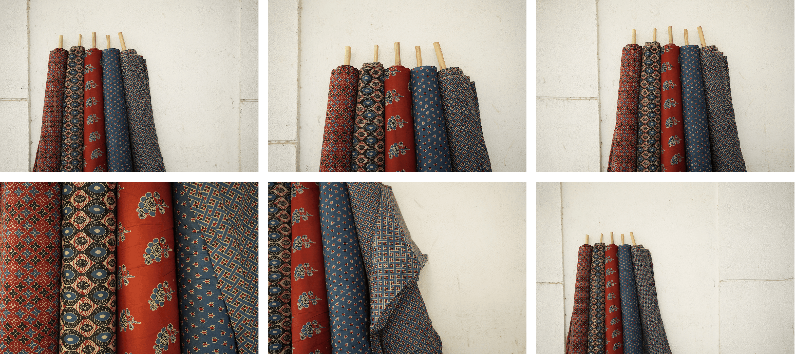
Photography Direction
Discovery revealed that trust in textile brands is largely built through visuals.
Therefore photography direction became part of design thinking, not an afterthought.
The photography approach focused on:
Natural lighting
Real fabric movement
Human interaction
Everyday usage contexts
Instead of flat product presentation, the aim was to show:
How the fabric lives with people.
This helps users imagine ownership before purchase.


Click here to go deep into the product photoshoot with details
Where and how will the user achieve the product goals?
Coming back to website design process
Collaborated with the team to create Information Architecture (IA).
After Validation the IA then what - site map?
I validated the IA with the stakeholders, product and tech team, I worked on creating a high level site map in FigJam.

wireframes
I explored different types of cards and screens for the positioning of different elements like CTA’s, Icons, Imagery, etc.
It also includes different sections of the page like header, utility header, main template, footer, utility footer etc.
Utilizing tools like Figma, we developed low-fidelity wireframes.

Click here to go deep into Lo-fi wireframes
04 deliver
Connecting Research to Final Decisions
Throughout the Discovery phase, certain patterns repeatedly emerged:
Users rely heavily on visuals while buying fabric online.
Trust is built through clarity and authenticity.
Too many choices create confusion.
Giving details in necessary.
People feel trusted with refund policies and also tracking is must of the order.
Craft-based brands often feel either too traditional or too commercial.
Instead of designing a product-heavy e-commerce interface, the intention was to create a calm and guided browsing experience.
Website Experience Strategy
We strategised the discussion/feedback we received in our research. And how in which form we can implement that in our website.
Insight Applied 01 - Simplicity Builds Trust
Research showed that users feel overwhelmed when textile websites display too many options without guidance.
Design Decision:
Clear category separation
Limited choices per screen
Generous white space
Certification rather than validating with information.
This allows users to focus on fabric and texture rather than navigation complexity.
Insight Applied 02 - Visuals Replace Physical Touch
Since users cannot physically feel fabric online, imagery becomes the primary decision-making factor.
Design Decision:
Large product imagery
Fabric drape and close-up shots
Lifestyle imagery showing real usage
Natural lighting to maintain colour authenticity
The aim was to reduce uncertainty during purchase.
Insight Applied 03 - Craft Should Feel Approachable
Competitive research showed that overly traditional presentation can feel distant to new audiences.
Design Decision:
Contemporary layout structure
Warm colour accents instead of heavy ethnic motifs
Minimal graphic distractions
Soft typography hierarchy
This helped maintain cultural identity without appearing dated.
Insight Applied 04 - Information Without Overload, not less and not too much.
Users need clarity about fabric details but not excessive technical information.
Design Decision:
Clear product descriptions
Fabric length and usage guidance
Simple, readable content blocks
Important details placed near purchase decision points
Exercise + Goal Completion 👏 -
"Visual Design"

Future Scope
The current outcome establishes a strong foundation for future growth:
Expansion into wider product categories
Enhanced storytelling through content
User feedback driven improvements
Scalable e-commerce experience for PAN India audiences
key reflections
Craft Needs Translation, Not ReinventionI
One of the most important learnings was understanding that tradition does not need to be modernised forcefully.
Simplicity improves usability more than adding features.
While designing the website, I realised that reducing clutter and creating clarity requires deeper thought than adding elements.
Empathy is Key
By involving users at every stage, we learned how essential it is to understand their needs and pain points.